Color – Propel from Crafter to Artist!
By Corinne Munger – 11 Comments
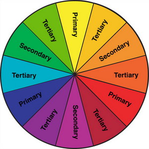
This combination will ALWAYS “go†together. Just like Purple with Yellow and Green with Red. Turquoise and Rust are just variances of Blue and Orange. Studies have proven that colors opposite each other on a color wheel, compliment each other more than any other color. So if you want your purple item to look as “purple-y†as it can, use some yellow (the correct shade of course) near it – it will intensify it! Need your Blue to “pop� Add some orange next to it. It actually works!
But why is this even important?
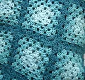
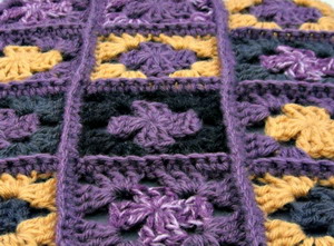
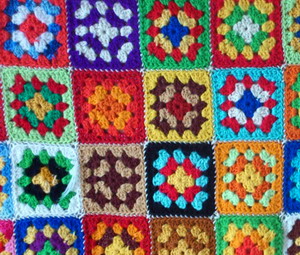
As crafters, you are also potential artists. The difference between the two is that as a crafter, you are making something with your hands – as an artist, you can take that craft to a new level. In this case, it’s with color. Learning color combinations, a very important trait in being a good artist, can make the difference between you “loving†your item or thinking it’s just “niceâ€. When something handmade catches your attention, I guarantee it’s (first) because of the color combination used that triggers something exciting in you. Here’s a test – if you had to purchase one of these items, which one are you most likely to buy?
I’m willing to bet that very few of you chose the last one. Yet all three of the items were made using the same pattern (granny stitch). Can you see the immense difference that using correct color combinations can make? So how do you know what “correct†combinations are? Colors have “properties†and these properties work with each other to make something pleasing to look at. If you don’t follow color theory, your art becomes difficult to look at – like the last granny square picture above. The brain can’t compute all the different colors into any sensible fashion. Let’s look at what some properties are:
Blue Properties: Temperature – Cool; Complimentary Color – Orange; Analogous (Equivalent) Colors – Blue Green, Blue Purple; Psychological Effects – Calming, soothing
Yellow Properties: Temperature – Warm; Complimentary Color – Purple; Analogous Colors – Yellow Orange, Yellow Green; Psychological Effects – Warm, Tires the eye
Red Properties: Temperature – Warm; Complimentary Color – Green; Analogous Colors – Red Purple, Red Orange; Psychological Effects – Love, warmth, comfort
The same properties are available for all colors on the wheel. Combining colors with similar properties always works well. All cool, all warm, analogous or complimentary. If you were to just stick with these 4 categories, you’d never produce a bad project (color-wise) again. There are many instructions on color theory on the internet. Color theory is a very involved concept and I could in no way explain it all here. But I can say that it would be worth every second you spend doing your own research on it – whether it be an hour or months of your time. Your crochet projects will only get better with this knowledge.
When I’m deciding on colors for new projects, I first think of the feeling I want to convey – feminine/masculine; flirty/demure; business-like/outdoorsy; etc. Then I have to choose the colors that will enhance that feeling. It’s hard to make a pink hat masculine and a black backpack flirty, agreed? I recently made a set of wrist warmers. I wanted them to state that I was a relaxed, easy going type of person. I made them in denim blue – perfect. Then I realized I needed a pair when riding the motorcycle. Those were made in black with cream trim (leather-like with a feminine touch), but I also wanted a pair for around the house when my hands got cold – those are light pink with a little ruffle. The same items say something different through a different color.
Your colors speak. Let them express your feelings for you. Everyone reacts to colors, so when choosing your project’s palette, do it with purpose and you won’t be disappointed with the result.
Research color theory on the internet. Study different color wheels (though they’re all pretty much the same). Before long, color combining will make sense and be emblazoned in your brain! Color makes all the difference in how you and others feel about your creations. Bring your craft to the level of art by being knowledgeable on color. It’ll be worth every moment you spend researching. I Promise.
How do you like to choose colors for your crochet projects? Feel free to share below!


Thank you for this information. I agree with you about the complimentary colours – the purple and yellow sample certainly looks much nicer than the others. I’m not all that great with colours so I’ll have to do as you suggested and research colour theory. Have a good weekend. xoxox
Hi Dorothy,
Picking the right colors for your projects will make you love them so much more! Let me know if you still have questions once you start researching it. Enjoy your weekend as well!
Wow, thanks for a great post, Corinne! I have to say, for crocheting for almost 7 years I still struggle with colors. I’d say my mom is the artist not me. So I usually choose color combinations that I have seen my mom choose. However, you have written a very helpful post and I thank you for that!
Thank you. I hope it leads you to try some combinations of your own!
Such an informative and well-written article. It is certainly true that we are drawn to certain color patterns. That’s how I end up buying half the magazines I do, because of the color combination on the cover or in most of the pages.
I will certainly devote more time to the study of color combining or color theory.
Thank you again for this
Thank you Donna! ANY amount of time you study on color theory will pay off. And it will make giving away or selling your items harder and harder! ha ha ha!
You worded things I’ve been thinking so damned well. I love color, and I see crocheting as painting with hook, which is amazing to me. I tend to lean towards analogous colors, but I like knowing about complimentary colors…
SO GOOD! I need this color wheel today. I am making an afghan with a gold yarn and I totally blanked on what color to compliment it with. My son came up to me with a Butterfinger’s pack, so I thought, okay, gold,blue and white, and they are kinda opposite each other (kinda!) they work, but I think I’ll try a tertiary or secondary form of the color! THANKS!
You brought up a good point…… Gold, White, Black, Gray, and Browns can all be used with any color on the color wheel as they are all NEUTRALS! So if you decided to go with “Butterfinger” colors, you’ll have a great combination! Thanks for writing!
I actually do like the last one best- It has a homey, friendly feeling to it, while the others scream ‘preppy’ and ‘show-off’ to me, respectively.
Thanks for the explanation. Helpful. However; I actually think the first example boring, the second example ugly and the last example gorgeous! So I say: don’t follow rules, follow what you love!